Overview
Kabin is more than an NFT dashboard, it’s a story-driven ecosystem that merges travel, collectibles, and real-world perks. My role was to define and lead the end-to-end product strategy and design execution. I was responsible for shaping the vision, writing key UX language, and guiding the team through delivery of a platform that would appeal to both seasoned Web3 users and total newcomers.
We reimagined what NFT utility can look like: not speculative or abstract, but tangible, gamified, and human.
Challenge
How do you design a Web3 platform that:
- attracts both crypto-native and crypto-curious users,
- ties real-world utility to NFTs,
- avoids technical jargon,
- and feels like a lifestyle product?
We had four key personas to satisfy:
- Art Collectors — care about visuals & rarity.
- Lore Lovers — want to feel immersed in a world.
- Tech Utility Holders — stake, swap, extract value.
- Social Traders — want hype, rewards, and easy exits.
The goal: create a product that feels like magic, not a manual.
Strategy
We took a layered, gamified approach, designing around the idea of “travelers” — collectible characters who unlock real perks in the Kabin world. The word “NFT” was intentionally dropped from most user-facing surfaces. Instead, everything revolved around personas, perks, and passes.
To execute this vision, we focused on 3 strategic pillars:
1. Seamless Onboarding
- We removed all complexity from login and wallet connection.
- Users could sign up with email, and connect wallets later.
- Language was rewritten to focus on actions, not blockchain.
2. Real Utility Layer
- Users earn points through staking Travelers (NFTs).
- Points unlock real-world rewards like hotel discounts, food, or free nights.
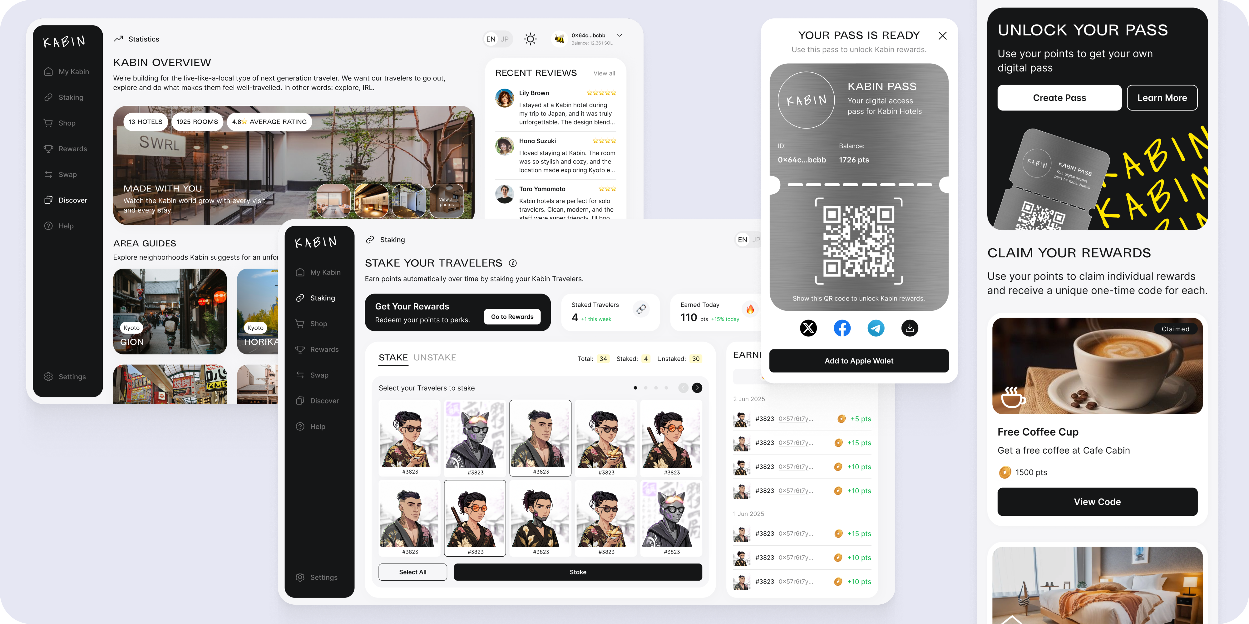
- Rewards could be claimed via a Kabin Pass — a QR code users could add to Apple Wallet.
3. “Playable” Dashboard
- Every section of the dashboard was designed to feel alive:
- A dynamic profile page (“My Kabin”) introduces your Traveler like a character sheet.
- A shop to collect more Travelers.
- A Discover section with real city guides.
- A Help center built for regular users — no crypto glossary required.
Key Screens & Features
1. Get Started / Login
Simple login flow, with wallet integration (Phantom, Metamask, Coinbase, etc.).
No jargon — just clean, friendly copy. Users can start with email and layer in Web3 features over time.


2. My Kabin
Your home base. Displays your traveler, traits, perks, and stats like nights stayed, shops visited, and rewards unlocked.
Designed to feel like a “game save” or RPG profile — not a crypto dashboard.
.png)
3. Travelers Shop
A clean NFT marketplace designed for browsing — not trading.
- Filters for rarity, style, and price.
- Solana pricing, but fiat-friendly visual cues.
.png)
4. Staking
One-click staking, with a narrative layer: “Send your Traveler on a journey.”
- No mention of technical processes — just choose your Traveler and let them explore.
- Yields are shown as “points earned per day.”
.png)
5. Rewards & Passes
Users could redeem points for perks and claim them via a Kabin Pass, which:
- Works like a loyalty card.
- Can be scanned IRL.
- Adds directly to Apple Wallet.
Design win: we made this card feel tactile and special — metallic texture, bold scan code, and share options.

.png)
6. Swap
A cross-chain swap tool letting users convert their NFTs into tokens and vice versa.
Hidden until wallet connection is enabled — reducing noise for new users.

7. Top Up
Let users buy SOL with a credit card — right inside the dashboard.
We optimized this to require no crypto knowledge:
- Three steps.
- Instant feedback.
- Purchase history + status indicators.

8. Help & Discover
- Help Center was written in full conversational tone, with tooltips and visual guides.
- Discover lets users explore real places recommended by Kabin (IRL content strategy).


Engineering Handoff
As the lead, I oversaw the handoff process and made sure implementation stayed on-vision.
Included:
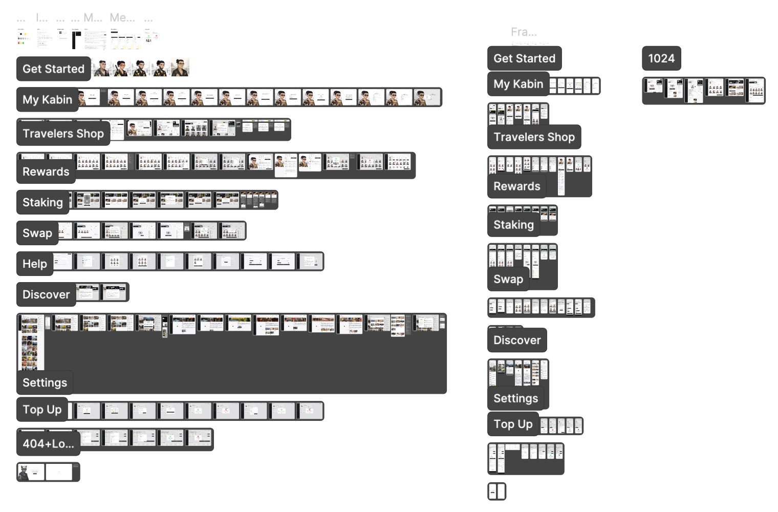
- Specs in Figma: States, padding, interactions
- Tokens: Color, typography, icon usage
- Component library: Mapped to design system, documented usage in dev-ready page
- Responsive behavior: All layouts reviewed and approved across breakpoints
- Dev notes & annotations: Especially for staking logic, pass generation, and multi-wallet edge cases
I also joined QA rounds, checking:
- Wallet disconnect flows
- Token swap edge cases
- Apple Wallet integration on real devices
Design System
We built a modular system with:
- A flexible color palette balancing soft neutrals, black, and yellow brand highlights.
- Responsive layouts for desktop and mobile.
- Systematized iconography and interactive animations (e.g. pass confirmation, wallet alerts).


Results
🚀 Launch-ready within 6 months
👤 4 personas covered with custom onboarding flows
🪙 10+ real-world rewards already integrated
📱 Apple Wallet & cross-chain functionality enabled
🧑🎨 30+ avatars with unique traits and utility
What I’m Proud Of
- Bridging complexity with simplicity: This wasn’t just a pretty UI. We reframed core blockchain concepts to be human-first, narrative-rich, and gamified.
- Strategic UX language: Every tooltip, button, and modal was reworded to sound like it belonged in an anime-RPG, not a tech dashboard.
- Team leadership: I set the product vision, mentored the design team, and reviewed everything hands-on to ensure consistency.


.png)
.png)
.png)


